The 5 Shades of “Pink” Makeup Brands Never Explain (And Which One You’re Actually Getting)
The 5 Shades of “Pink” Makeup Brands Never Explain
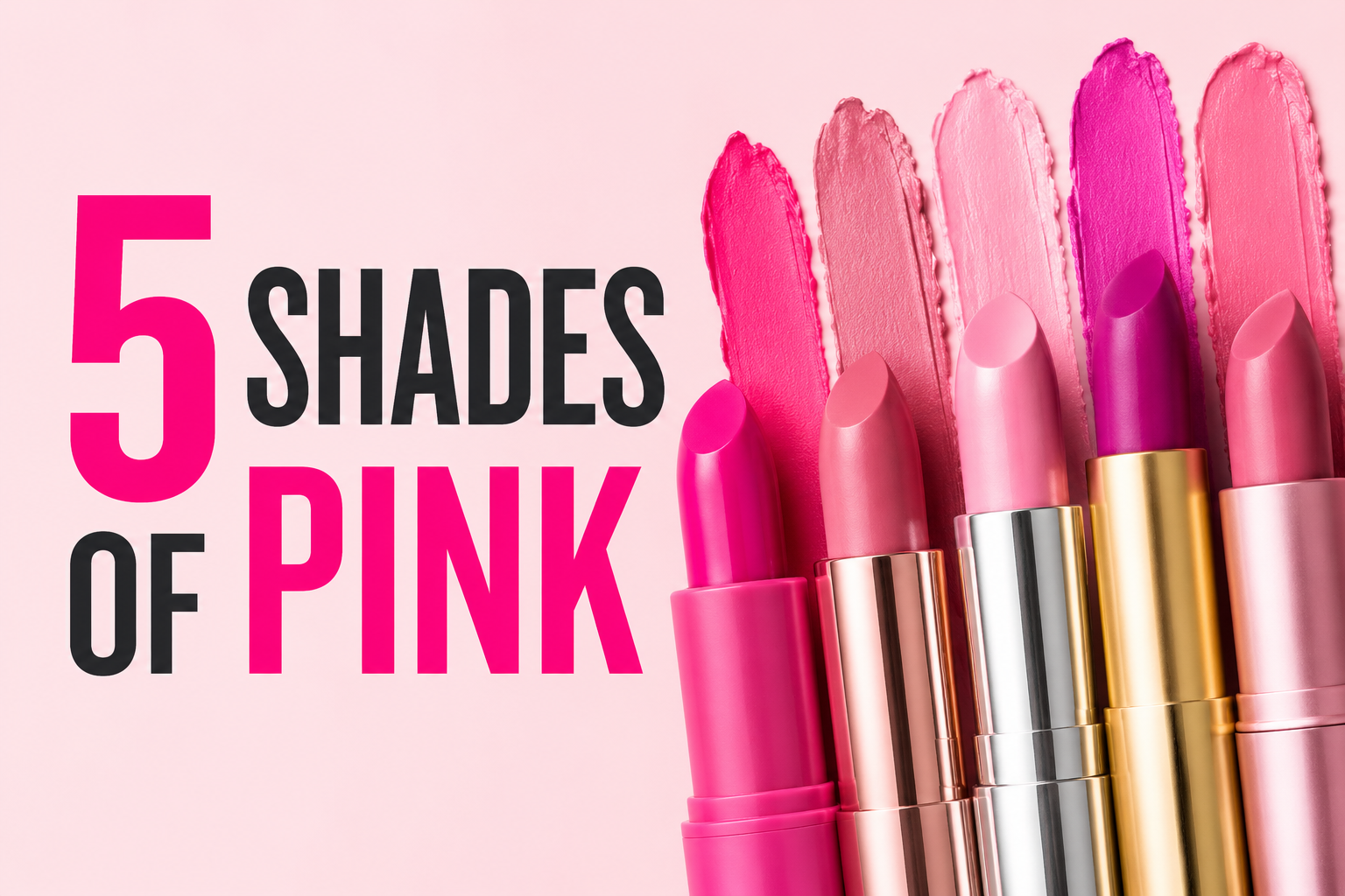
Every brand calls their lipstick “pink.” That word is doing an enormous amount of work. Order a “pink” lip cream from three different brands and you’ll get three different colors that have almost nothing to do with each other — one leans orange, one leans purple, one looks nothing like the swatch photo once it’s actually on your lips. Nobody warns you about this before you buy, so here’s the breakdown nobody gives you: the five pink families that actually exist, what to search for so you land on the right one, and a real product to try in each.
Barbie Pink (Hot, Cool-Toned, Blue Undertone)
This is the shade everyone means when they just say “pink” without thinking about it, especially since the Barbie movie put it back in the cultural bloodstream. It’s bright, saturated, and leans slightly blue rather than orange, which is actually what makes it look so clean against most skin tones — it brightens teeth instead of making them look yellow. NYX ran an entire Barbie collaboration built around this exact hue, including shades in their Butter Gloss and Smooth Whip Matte Lip Cream lines, and they’re a genuinely good starting point if you want the shade without hunting through a dozen brands to find it. If you’re shopping blind, search for “cool-toned fuchsia” or “blue-based pink” rather than just “pink” — that phrasing filters out the muddier, warmer options that show up when you search the plain word.
Millennial Pink / Dusty Rose (Muted, Warm-Neutral)
This is the pink that dominated home decor and branding for the better part of the last decade, and it shows up in makeup as a soft, slightly grayed-out rose that reads as understated rather than bold. It’s the shade people usually want when they say they want “your everyday, natural pink” and then get frustrated when a product labeled “nude pink” turns out shockingly bright. If a listing photo shows a chalky, faded-looking pink rather than something vivid, that’s this family, not a bad photo. This is also the shade most likely to show up dramatically lighter or darker in person than online, since the muted, low-saturation pigments are the hardest for product photography to capture accurately, so check for a brand that shows a swatch on actual skin rather than just a shot of the tube.
Baby Pink (Pastel, Light, High Value)
Very pale, very soft, almost more of a sheer wash of color than a full pigment. This is the one that gets requested most for anything gift-related or nursery-adjacent, since it reads as gentle rather than bold. The tricky part with baby pink specifically is that on darker skin tones it can wash out to nearly invisible, and on lighter skin tones a cheap formula can look chalky instead of soft — this is the shade family where formula and finish (a sheer balm versus a flat matte) matters more than the actual pigment.
Hot Magenta / Berry Pink (Deep, Warm, High-Saturation)
This sits right at the edge between pink and purple and it’s the one most likely to get mislabeled, since some brands call it pink and others call the exact same shade “berry” or “orchid.” It’s a bolder, more grown-up option than Barbie pink, works well for evening looks, and tends to photograph darker than it wears in daylight, which is the opposite problem from most of the other shades on this list. If a product photo looks almost purple, it’s probably going to wear as a rich magenta in person rather than the true violet it looks like on screen.
Millennial Blush Pink (Cool, Powdery, Cheek-Focused)
This one’s specific to blush rather than lips, and it deserves its own category because “pink blush” searches return an enormous range of results that don’t remotely match each other. Christian Dior’s Rosy Glow in shade 001 Pink is a reliable reference point for this exact family — a cool, almost powdery pink that’s become a repeated pick across Barbiecore-adjacent beauty roundups for a reason, since it gives a genuine flush rather than a stripe of visible color.
The Actual Fix
Stop searching “pink lipstick” or “pink blush” on their own. Pair the word with an undertone descriptor: “cool-toned pink,” “warm dusty pink,” “blue-based pink,” “berry pink.” That single change filters out most of the mismatched results before you ever click into a listing. And when you’re comparing product photos, trust a swatch shown on actual skin over a shot of the packaging every time — packaging photography is lit to make the color pop, not to show you what it’ll actually look like on you.